Illustration (Negative) |
|

|
Title: A Lively Couple
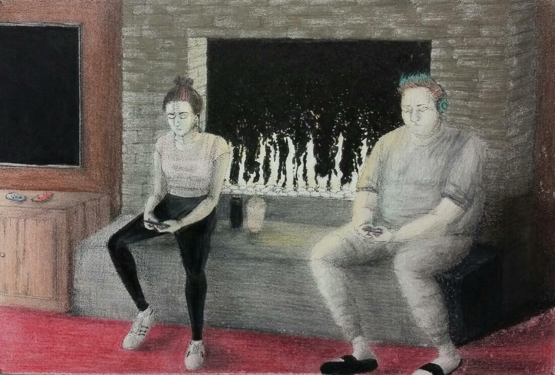
Size: 38 cm x 25.2 cm (14.9 in x 9.9 in) Medium: Colored pencil and archival ink on illustration board Completion: November 2017 A Lively Couple is a modernization of the painting, Chimney Corner, by Henry Mosler painted in 1893. The painting’s style derived from “Genre Painting”; paintings of everyday life. This illustration was meant to transfer the ideal of the original painting, which showed a man and a woman socializing, to what people in modern society might look like if they were in the man and woman's place. |
Critical Investigation Research:

"Chimney Corner", Oil on Canvas, 1893
|
Henry Mosler and his painting, "Chimney Corner" was the inspiration to my piece. In his painting, a young man and woman are having a possibly romantic conversation while sitting on the bricks of a fireplace. When I saw this painting, I immediately thought of what people in modern day society would be doing in that situation. They would be on their phones.
"The Chimney Corner" Phil Armstrong. http://www.philarmstrongart.com/blog/2015/8/22/chimney-corner-by-henry-mosler
"Henry Mosler." SAAM. https://americanart.si.edu/artist/henry-mosler-3435 |
Inspiration:
I inspired my piece- like my positive illustration- after the whole structure of a classical painting, "Chimney Corner". I replaced the man and women in the original with modern teenagers but put them into the same places they sat in by the fireplace. Unlike my positive inspiration, I did not want these figures to carry the same meaning as they do in "Chimney Corner". Instead of having the man and the woman facing one another in intriguing, friendly poses, I gave the man and women boring, uncomfortable-looking positions to symbolize their plainness and negativity. I also replaced the fireplace in the background with a new, modern 'flare' fireplace, the shelf with a flat screen TV and cabinet with video game controllers and the bellow the woman is holding I replaced with an energy drink and coffee. I gave my title a sarcastic tone, "A Lively Couple". I could have researched other artists to find a better comparison between modern society and society back then, but when I saw this painting, I immediately found inspiration to create this illustration.

|

|
|
Detail of Chimney Corner.
|
Detail of A Lively Couple.
|
I wanted for this illustration to be as realistic and detailed as the original painting like I attempted in "Wedding Reception". So I used the same technique; stippling the whole Illustration. Stippling allows for very fine detail and value; the more stippling, the darker an area gets. I wanted the lighting in my piece to be similar to the lighting in the original but I was unsatisfied with how mine came out. At first, my colors were pale because I didn't know how to make them dark and colorful. But, after seeing other students work at the critique at MIAD (Milwaukee Institute of Art & Design), I realized that I had to just go for it and press down harder on the colored pencils. I forgot to include the light illuminating from the teenagers phones but I thought the way they are slouched over with their eyes looking down was enough of a sign as to what they're doing.
Planning:
Along with my other Illustration, I decided on making my piece using inking pens and colored pencils. After I chose what my pieces would be inspired after and the positive and negative reasons behind them, I started to work on this one more than the other. The reason was because I felt like I used more of my style in this piece than the other illustration. In "A Lively Couple", I changed the positions of the two to fit more of a modern pose of looking down at a phone while in "Wedding Reception", the figures stayed true to the original painting.
At first, I was going to have the man and woman in the same positions as they are in the original, facing one another, but still be looking at their phones. Then, I thought of having them facing opposite ways so they wouldn't even acknowledge each other at all. But, ultimately, I decided they face the same way. I sketched out the figures into my sketch book to get a general idea of their shape and position and their correlation with the room. This was the only sketching I did.
At first, I was going to have the man and woman in the same positions as they are in the original, facing one another, but still be looking at their phones. Then, I thought of having them facing opposite ways so they wouldn't even acknowledge each other at all. But, ultimately, I decided they face the same way. I sketched out the figures into my sketch book to get a general idea of their shape and position and their correlation with the room. This was the only sketching I did.

|
To start off, I was given an illustration board (38 cm x 25.2 cm) and the freedom to choose any media I wanted. I was shown examples of illustrations with ink and colored pencils so I decided to stick with those mediums But, before I started any of that, I printed out the reference painting "Chimney Corner" onto a sheet of printer paper that I'd use to accurately position the objects and the couple.
I sketched out the an idea of what I wanted the figures to look like in the illustration. I drew a valued sketch of what the woman in "Chimney Corner" looked like to what I'd be turning her into. At first, the girl was holding up her phone about to take a selfie while the boy was hunched over his phone farther than how I drew it onto the board. I replaced the man and woman's hats with hairstyles seen in modern society and also their clothing with popular styles from the top named brands now. |

|
Technique & Experimenting: I planned to heavily rely on the 'stippling' technique in "A Lively Couple" to show value and values of the forms. When a shadow was very dark in the original painting, I would then ink that space in with solid, black color. When it came to the hair, at first, I tried to stipple each individual strand and the space between, but I decided not to. It would look funny and my inking pens were not small enough for that kind of detail, so I stuck with drawing lines. I would made quick, curved strokes for the boy's hair and controlled, heavy strokes for the girl's. As I look back, feel that if I spent more time patiently stippling, the forms and shadows would've looked way better.

|
Process:


|
Drawing: I used the grid method in order to transfer the image of the Chimney Corner precisely as it is onto the illustration board. After I transferred the image onto the board, I started drawing hairstyles and most popular name brand clothes you'd see teenagers wearing. I tried to create a full, detailed drawing that I would ink over using the stippling method, but I decided that would take awhile and began to ink early on. As I look back, I should have waited on the inking until the whole drawing was finished. If I finished the drawing, the shading and forms would look more precise and visible and the picture overall would look better. Like the positive illustration, my original idea was to create a drawing with very detailed value in it, and then to ink over the drawing. I also rushed this and inked while the drawing was mostly a sketch.
Inking: I started inking earlier than expected, so I depended on the ink to make up what I didn't plan to be in the Illustration originally. I decided to use the technique of stippling for my illustration. I learned about stippling in previous art classes and practiced it in freshman art foundations so I felt pretty confident in using it for my illustration. With a thicker inking pen, I filled in the TV Screen in thick and curved stokes but for the fireplace, I stippled so the fire would looked more flared. I tried to stipple everything; I heavily stippled the girl and boy's clothing and faces but I started to get lazy with it and just began to stipple the outlines of their bodies, relying mostly on colored pencils to fill in the blank. What I learned from the critique at MIAD (Milwaukee Institute of Art & Design) is to ink the drawing so if there were no colored pencil, the ink could stand alone. As I stippled, I felt like my skill in the technique increased; I learned how to control whether a dot was big or small and how to make areas lighter and darker and I also noticed how precise and accurate my stipples would get as I focused on the illustration. After the image was inked, I erased the board and started to color.
Coloring: When I first started coloring, I was very disappointed with the texture of the colored pencils I was using; The white Illustration board was very easy to see under my colored pencil. One of my friends gave me advice as to how I could make the texture look better, which was going over it with a white colored pencil. So, I started to do that. I noticed how the colors blended better but also made them a slightly different color when I used white over them. The colors of my inspiration are much more smoother and lush then the colors I have on my Illustration.
At first, I didn't know how hard I can press down to make a darker color, so my colors were very pale and boring; which is something I want to convey to the viewers of this artwork however, but, I still wanted my colors darker. I tried to create value by pressing down harder in dark areas, but it still wasn't dark enough. Until, after the MIAD critique, as I looked at other students' colored penciled illustrations and realized how dark they were, that's when I went back into my Illustration and just went for it, pressing down as hard as I could. It turned out looking better. I kept the girl and the boy in pale colors though, to show their plainness. I tried to mix colors together to get the affects of the different light sources in the room. I mixed yellow with the colors around the fireplace and black with colors farthest away from the light source. Doing all of these techniques made me more knowledgeable with colored pencils. |
Reflection:
Overall, I liked the look of the illustration. I liked how when I went back in ti redo the colors, they came out more full and colorful. I didn't really like the color palette I used, but it contributed to the idea of how this is supposed to be boring. In the future, I'd find a way for the colors of the artwork to look more solid and distinguishable from others. The man wearing gray and white seems to blend in with the base of the fireplace. I did like the way I stippled mostly everything. Sometimes the inking pen would make bigger dots or I'd stipple over the same area to much which would create a big black circle. I'll have to be careful of that next time I do a project like this. I liked this Illustration better than the Positive one because I felt like I used more of my style with this project since I drew the position of the girl and the boy differently than the original, this art piece's colors were darker, and because I thought out the meaning behind the work more than I did with the other illustration.
ACT Questions:
1. Clearly explain how you are able to identify the cause-effect relationships between your inspiration and its effect upon your artwork.
I used the same figures and perspective in my piece which was directly inspired from "The Chimney Corner" by Henry Mosler.
2. What is the overall approach the author has regarding the topic of your inspiration?
The author has a factual approach to my inspiration, Henry Mosler.
3. What kind of generalizations and conclusions have you discovered about people, ideas, cultures, etc. while you researched your inspiration?
I generalized how artists like Henry Mosler were very important in society back then during America's civil war with depicting scenes of life.
4. What was the central idea or theme around your inspirational research?
The central idea was how Mosler conveyed emotions through the painting, "Chimney Corner".
5. What kind of inferences did you make while reading your research?
An inference that I made while reading about 'Henry Mosler' that during the time he was alive, genre painting was very popular in America.
